
Meet our Client
Sanofi is a global healthcare corporation with its main office located in France. The company researches, produces, and distributes medications.
With more than 90,000 employees in 50+ countries, it was the 8th largest pharmaceutical company in the world by revenue in 2023.
The symptoms: ugly UI and scattered functionality
Sanofi manages the distribution of its medicines to a broad network of pharmacies in one line of its business. Additionally, they supervise sales managers and monitor business processes and the quality of data received from partner pharmacies.
For that purpose, our Client used a system designed for generating reports and analyzing business data, capable of handling large data volumes. This system was built on a database that featured an array of interconnected directories, tables, and lists.
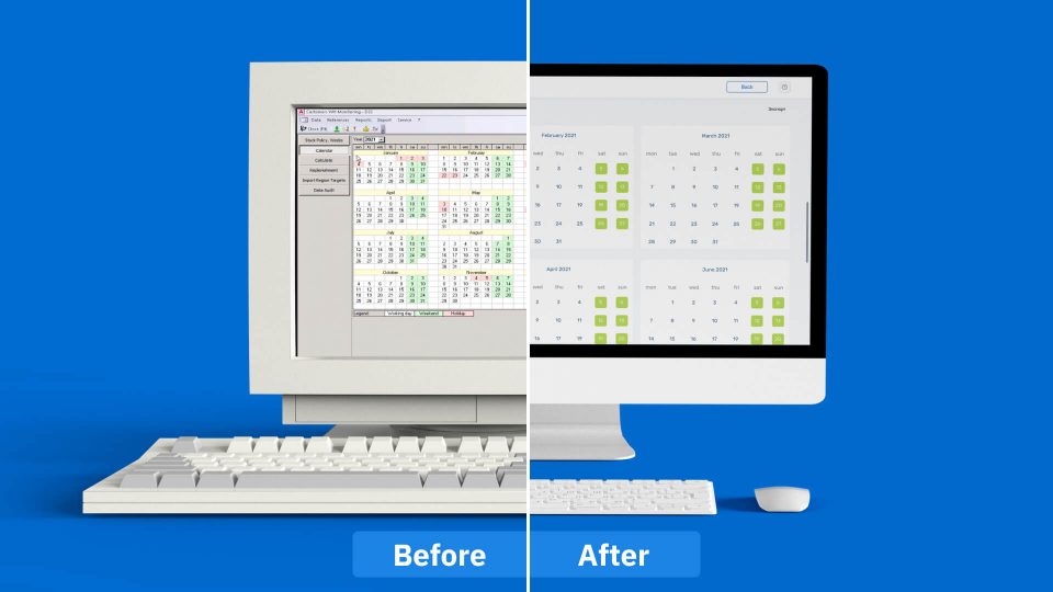
The problem was that the old system looked outdated, inconvenient, and sometimes plain ugly with each module having its own style.
Besides, some of the functionality was housed in Salesforce, some in Excel, and the rest in scattered modules and systems.
To serve their employees better, Sanofi wanted to modernize the visual style, make the system user-friendly, and consolidate it into a single platform.
The intervention: bringing in external experts
SENLA’s UX/UI experts became part of the team working on the system's new design. We partnered with Sanofi in 2020.
The first module of the solution was ready within 2 months.
After we completed the work and the Client was happy with it, they asked us to redesign four more modules of the system. Later, they came for more.
Eventually, over the two years of our partnership, we designed about 20 subsystems.
The patient: an outdated data management system
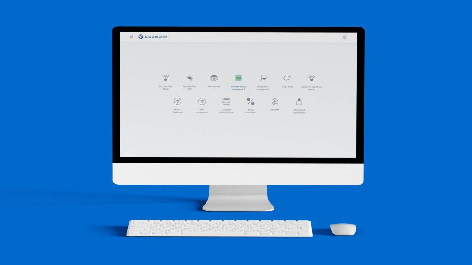
The system we worked on included various modules for managing pharmacy-related activities.
- Reporting. Generate reports on a monthly, quarterly, semi-annual, and annual basis. For each report, users had to select a type, add exclusions, set parameters, and choose the time.
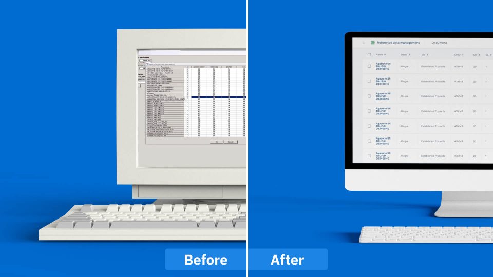
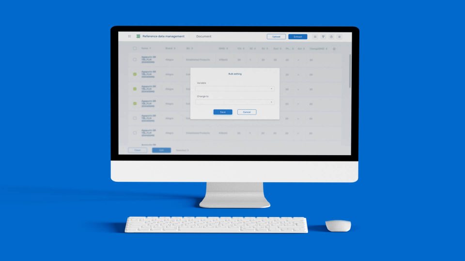
- Reference data management. Monitor and edit directories, such as lists of drugs, apothecaries, etc.
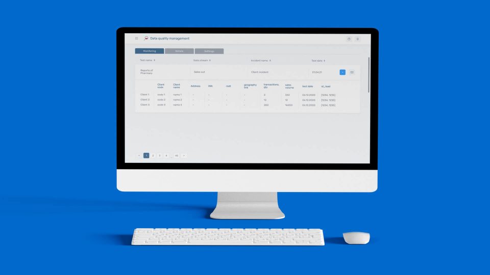
- Data quality management. Process, verify, and store data.
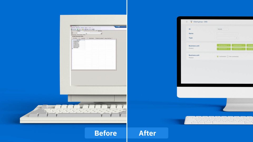
- Admin. Display and assign roles in the system for users with configurable restrictions: by location, customers, etc.
- Reallocation. Manage logistics, track, and dispatch medications between pharmacies in the network.
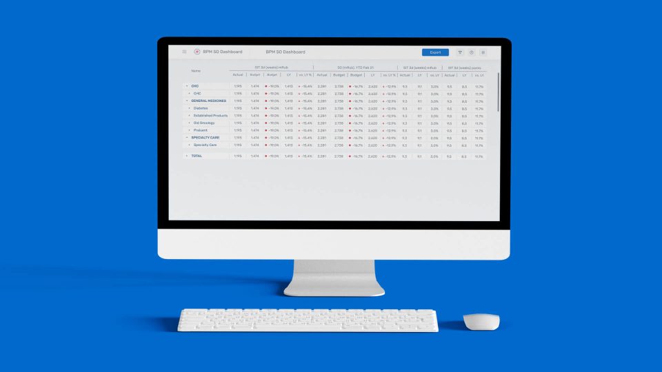
- Bonus calculation and sales accelerator. Calculate bonuses and implement an incentive system for sales managers.
The treatment: rehauling the whole UX/UI
Sanofi wanted to move away from the existing obsolete table view and create something more engaging and user-friendly.
For Sanofi, as for every UX/UI project we undertake, we proceeded with the following process steps.
Phase 1
- Interview users. We talked to the system’s users to identify the strengths…
- Identify pain points. …and weaknesses of the existing solution.
- Analyze similar systems. We researched popular systems with the same functions and how they operate.
Phase 2
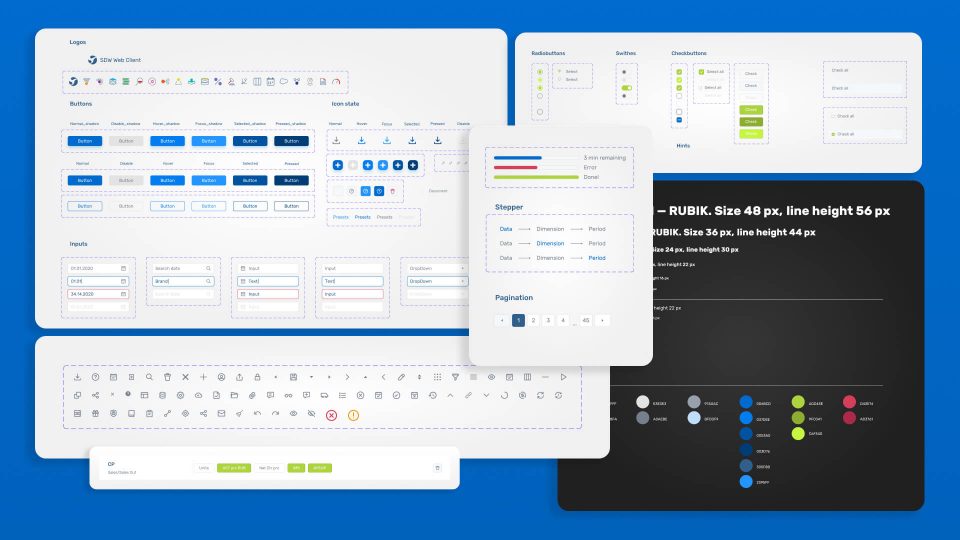
- Define the style. As the system's modules originally had different looks, we needed to establish a common style to unify them into a single platform. We put together a mood board and presented references to the Client.
- Create blocks and modules. We prepared wireframes with a medium to high level of detail.
- Create a UI kit. We put together a stylistic and design kit for the project, along with common behavior patterns (based on the interviews).
Phase 3
- Design individual screens. Each subsystem had originally functioned differently and we needed to consider that.
- Agree on visuals and structure. We worked closely with developers to align our designs with the system's functionality.
- Drawing of static screens. We created all the tables and UX modal windows.
- Clickable prototype. Finally, we developed a clickable prototype, which was demonstrated to the Client and the focus group.
The surgical team: close collaboration
To work on a project of this complexity, a UX/UI expert has to collaborate with many other specialists.
- We had a focus group of several data managers in Sanofi with whom we tested the interface, received feedback, and made revisions.
- We interacted with many of the Client's business analysts. Based on interviews, we identified and solved user pain points for smoother data handling.
- We collaborated closely with the back-end developers. Sometimes we had to adjust the layouts like adding/removing buttons, because the system operated differently. We tried to balance usability, aesthetics, and back-end functionality.
The instruments
We worked in Figma, Photoshop, and Adobe Illustrator.
We had to create all the icons from scratch in Adobe Illustrator because no existing ones met our needs.
The value: Better decision-making and efficiency with a user-friendly platform
The UX/UI design we created for Sanofi ensured their sophisticated data management system both looked and worked smoothly.
As a result, Sanofi enjoys the following benefits with the redesigned platform:
- The system is easy to use and looks good. This makes employees happier and more productive because they don't have to struggle to learn many different interfaces.
- Since all the parts of the system now look and work the same, Sanofi can now quickly get a clear picture of its data. This makes it easier to understand what the data is saying, helping the company make smart decisions faster.
- By moving away from scattered and inaccurate manual processes, Sanofi ensured that everyone could work more efficiently and with fewer mistakes.
- With the new system, Sanofi enhanced engagement with partner pharmacies and sales reps, making sure their medicines got to the right consumers at the right time.
More focus on UX/UI might be all you need to boost your success. At SENLA, we've got a wealth of experience in this field and we're eager to help.